This week, I finished lettering the next chapter of the Legends of the Dracorex graphic novel. Here is the first of six pages of “The Colony” to whet your appetite.
Artist Eliseu Gouveia once again did an amazing job bringing my original script and rough page layouts to life. He’s an outstanding collaborator who not only came up with ingeniuous visual solutions to some problems that had me stumped on page one, but also found inspiration in the recent solar eclipse and took the intitiative to add a darkened sun to a ritual sacrifice scene.
My original script did not call for an eclipse, but the darkened sun was so perfect for the scene that I altered the final script to fit. The completion of this chapter leaves us with one more episode to finish this summer, plus a full-color cover illustration, then I’ll be ready to publish the 48-page graphic novel.
If you’re following developments in AI-generated art, then you’re familiar with the negative criticisms: AI is garbage. AI is racist. AI is plagiarism. AI is putting artists out of business. In the face of such backlash—all of which I take seriously—why would I even consider using AI to generate illustrations for my latest book?
The only criticism that might actually hurt my feelings is that my decisions are putting artists out of business. The reality is that Gods of Titanand Other Tales generated more income for other artists than any of my previous works, because I hired a professional comic-book illustrator to draw a six-page story that’s included in the book, and we plan to work together again in the near future. And in The Second Omnibus, there’s another six-page comic-book story I paid an old friend to draw, plus I hired a talented young artist from the Philippines for the cover illustration.
In my work as an editor of other people’s books, I’ve referred several projects to a UK-based artist who does excellent book cover design, original illustrations, and maps. I’ve also used Shutterstock to get images for several of my own books, and though I can’t imagine the artists get paid much for the image licensing, I have to assume that if the scenario was completely worthless to them, then they wouldn’t have a relationship with Shutterstock.
It’s also worth considering that, as far as my fiction series and most of my other books go, I am the artist. My interiors and covers have often featured my original drawings and paintings, logo designs, and cover designs. So who would I be putting out of business—myself?
With that context in mind, I enjoyed playing with AI to add some visual flair to the latest book. I got images I thought were pretty cool for the chapters and cover, far more than I had the time or skill to draw or paint on my own, and within my limited production budget. It wasn’t like anyone else was going to get paid for illustrating the book. It was either AI or me or nobody.
While exploring this relatively new technology, I learned a lot through research and reading and discussions with other creative types, and thought more about the implications of AI than I would have otherwise. It’s been a recurring topic on this blog in the two years I’ve been working on Gods of Titan.
I also found ways to use AI that would help the artists I’ve employed or referred to. By playing with the robots and feeding them concepts I was working on, I could eventually get visual results that depicted a certain mood, or color scheme, or scenario I was going for—something I could show my artists not with the intention of asking them to replicate it but as a springboard for stimulating ideas and inspirations, a starting point they could work from to do their own thing. Sometimes it’s easier for everyone if you can show someone an image rather than write a thousand words telling them about what you have in mind—kind of like taking a photo from a magazine to your hair stylist instead of trying to explain the haircut you want.
And as a writer and artist, I found ways to bounce ideas back and forth with AI image generators and chatbots to initiate a flow of creative ideas. This was especially helpful to me as I haven’t had a critique group to work with in a few years. And even if I did, no one wants me calling them at three in the morning to argue the moral implications of building a positron machine to send messages back in time. But robots? They don’t mind my weird insomnia at all.
Can AI be used for nefarious purposes? Of course. A hammer can be used to build a house to shelter people, or it can be used to bash in their skulls. Nuclear fission can provide electric power to an entire a city, or blast it off the face of the Earth. A tool or tech is not inherently good or evil, though its uses most definitely can be.
Finally, from the philosophical perspective of a lifelong reader and writer of science fiction, it seems natural to creatively explore a technology that once dwelt exclusively in the realm of fiction but has now become real. Incorporating a sci-fi tool in the production of a sci-fi book feels like too tempting of an opportunity to pass by! If I had a total lack of curiosity about AI, I would probably not even be qualified to be writing SF in the twenty-first century. When writing about the asteroid-mining frontier, how could I not be interested in the current real-life frontiers in space exploration, robotics, genetics, and more? Did you know a new aircraft is being designed to explore Mars, and that its name is MAGGIE? Meteor Mags would love it!
While I understand the criticisms and fears about AI, and I feel they are all legitimate things worth discussing and addressing through public policy and efforts to improve the tech, I couldn’t see those things as reasons to not take the robots for a test drive and see what they could do. The printing press might have put a lot of monks out of a job of transcribing manuscripts by hand. The camera was once feared as putting painters out of business. Desktop word-processing software might have threatened the jobs of typists. And on and on. But technology keeps moving forward, and creative people can move forward with it. The future keeps arriving with every passing second. What will we do with it?
In 2023, I connected with Portuguese artist Eliseu Gouveia to work on a six-page comic-book story about the prehistoric lives of the evil space lizards that appear in many of the Meteor Mags stories. Eliseu—Zeu to his friends—did an amazing job of taking my rough script and crudely sketched mock-ups of the pages and bringing them to life. I will eventually be lettering them, but I am excited about the inked artwork and want to share a couple of pages with you.
page two of six
I intend for this six-page episode to be part of a collection of five stories about the Dracorexes’ rise to power in the late Cretaceous and their eventual escape from Earth before the asteroid impact that ended the reign of dinosaurs. This episode is based on the myth of Prometheus and features a benevolent Quetzalcoatlus who befriends a dinosaur tribe and educates them about fire, agriculture, and written language, helping them become more technologically and socially advanced. But the nasty Dracos want to keep technology to themselves, so they confront Quetzal and his peaceful friends.
page three of six
The final three pages are deliciously violent and horrifying. These tales of saurian savagery take place millions of years before the Meteor Mags series begins. One episode—drawn by my old friend Brian Bowhay—appears in The Second Omnibus. Brian and I worked on it before I conceived of Mags and her adventures; in fact, the evil space lizards Mags fights were repurposed from my earlier ideas for villainous sci-fi dinos.
As author Tony Padegimas once asked me in a workshop, “Are there any space lizards who are not evil?” Tony had a point, but I just think it’s fun to say “evil space lizards”. Even more fun than that is seeing them come to life on the page thanks to Zeu! Our collaboration inspired me to take my rough ideas for the remaining stories and refine them into proper comic-book scripts. Zeu and I plan to produce another episode this Spring, taking us one step closer to a complete graphic novel.
Update: The completed mini-comic now appears in the book Meteor Mags: Gods of Titan and Other Tales, for sale on Amazon in paperback and ebook.Customers outside of the USA, please see https://mybook.to/godsoftitan.
In 2009, my sister visited me in Arizona, and we went to the Dale Chihuly exhibit at the Desert Botanical Gardens in Phoenix. I used to have a lot more photos at higher resolution, but many of my photos from the early 2000s were victims of a transitional period where I made some mistakes with photo storage. So, here are the seven survivors from that amazing exhibit of glassworks in a desert environment that was in full bloom for spring. The glasswork was gorgeous during the day but also impressive when it was lit up after sunset.
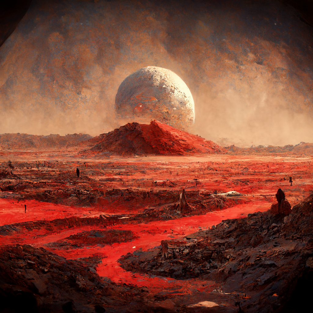
The painterly image above was one of four generated in about a minute by Midjourney, an artificial intelligence that creates images based on prompts you give it. You can find Midjourney on Discord and put it to work for free at discord.gg/midjourney or start out at Midjourney.com. The prompt for the image above was “/imagine mars will send no more”, the title of this blog.
Below is a variation on the prompt “/imagine calico cats become space pirates and conquer the moon in the future”. It looks to me like a vintage science-fiction book cover, but painted on drugs.
If I had known about Midjourney a month ago, I probably would have used it for cover art to Permanent Crescent. The only drawback is that copyright doesn’t seem applicable to A.I.-generated imagery, at least according to this month’s article in The Register, which features Midjourney’s founder.
Below is a result of the prompt “/imagine alien dragonfly attacks a space colony”. Truly trippy!
I’d never used Discord before today, but I’ve been curious about trying A.I. Art platforms and saw some amazing Midjourney renders this week on Reddit. You can get about 25 renders before needing to pay for a Midjourney subscription, and you are basically producing them in an open chat room. On the one hand, that’s a little annoying because there are dozens of people using the robot all at once, so it is hard to keep track of your images while new messages are entering the chat every couple of seconds. On the other hand, it’s fascinating to see what everyone else is conjuring with the robot. (A paid subscription allows you to invite the robot to your own chat room so you can work with it one-on-one.)
My renders for “/imagine giant space wasps attacking people on an asteroid” looked cool but not at all like wasps. However, I was impressed with the results for “/imagine telepathic space octopuses controlling the brains of dinosaurs“!
I used up all the images from my free trial, but I will return to play more with Midjourney. Below is a gallery of the stuff it made for me today in about an hour based on the five prompts I’ve shared with you.
Note that these are “upscaled” versions. The first thing Midjourney does is make a set of four low-resolution images, which you can then instruct it to “upscale” individually to get more detail and greater resolution, or you can tell it to create “variations” of any of the originals (which can also then be upscaled). You also have an option to “upscale to the max”, which means even higher resolution.
One of the unaddressed, human problems for atheists is the concept of irrationality. While I feel that Richard Dawkins and his Foundation for Reason and Science are a good example of the intellectual trend that needs to become more widespread in America and across the globe, an appeal to humans to be completely rational faces an intractable problem. Despite our capacity for reason and rationality, we also experience life in non-rational ways.
While the scientific method often reveals an underlying order to the chaos we experience, we cannot say the universe itself is rational. Everyone knows what it is like to confront events in life that seem totally absurd. Entire movements in the world of art have sprung up to address this. No matter how much we want to believe that we could be completely rational beings, the human mind is a playground for irrational thoughts, beliefs, and behaviors.
My observations of the behaviors of others and myself in my five decades on this planet lead me to conclude that a purely rational approach to life leaves out some important aspects of human experience. I believe this contributes to the persistence of religion, even in eras such as ours where organized religion, zealotry, and extremist fundamentalism produce or justify violence, suffering, misogyny, racism, and abuse. The evils committed in the name of religious good or faith remain unshakable to this day, and those of us who have opted out of our religious backgrounds find this both sad and perplexing. How, we ask, can people continue to cling to primitive, Bronze-Age ideas that breed hate and intolerance and prevent society from progressing towards more humane and inclusive goals?
Many before me have attempted to answer this question, so let’s consider the four most common evaluations. First, humans fear death. Religion offers comfort in the face of a universe that in no way cares about any individual, by creating deities who do care. Religion offers comfort in a universe where everything we are is guaranteed to end, by creating an artificial afterlife where we can live on.
This afterlife is often posited as a form of justice which is absent from the actual universe, an afterlife where “good” people are rewarded and “bad” people are punished. In real life, horrible people get away with horrible things while kind and decent people suffer. Imaginary concepts such as heaven and hell give comfort that there is a form of cosmic justice that exists beyond this world.
Second, humans crave order. Disorder is frightening. The unpredictability of life is frightening, and humans are not alone in this fear. Consider how stressed a pet dog or cat can become if their routine is disrupted, or if forces beyond their comprehension appear to threaten them. If you’ve ever seen a pet hide under a bed during a thunderstorm, or develop oddly unhealthy habits around grooming and eating to deal with stress, then you know what I mean.
In the face of this fear of the disorderly and unknown, religion grants the illusion of cosmic order and also creates an imaginary ruler of that order, one who can set things right or who has a master plan in which we can place our trust. This non-existent cosmic ruler also imposes a moral authority that sweeps away the supremely challenging ethical task of deciding for oneself what is right and wrong—a task plagued by the same disorder and incomprehensible complexity of the world we experience. Deciding for oneself is hard. Having an authority hand you the answers is easy.
Third, humans look for agency. Part of progressing from an infant to a socially mature adult is the realization that other humans and even animals are like oneself in that they have agency. Others can make decisions and choices, have feelings and thoughts, and presumably have some kind of experience of life that is conscious in the same way that we are conscious. Empathy is when we come to consider that the experience of others is something to be respected, understood, and treated with kindness, because we can imagine that we know what that other person or animal feels. Their pain is like our pain. Their hopes are like our hopes. Their joy is like our joy. Their problems are like our problems.
But as important as this empathy toward other agents is to social cohesion in groups—from the smallest tribe to the largest nation—the human mind also seeks to find conscious agency in objects and events which simply have none. A rock or a bolt of lightning or a gust of wind has no agency, but the human mind naturally wants to believe it does. On one end of the religious spectrum, this results in pantheism where every object possesses some form of consciousness. At the other end of the spectrum, it results in monotheism where every action of every object is guided by the conscious choices of some cosmic ruler.
In the middle of the spectrum lie various gradients of these ideas. Though none of them are true or even remotely provable, their allure is the comfort that we do not live in an unfeeling and unconscious universe, but one where we might affect the outcomes of events by supplicating these non-existent agents through prayer, sacrifice, good deeds, wars against non-believers, and many other actions which do not affect the physical behavior of the universe.
Our attempts to appease the gods might make us feel better, or they might lead to atrocities, or both. They might lead us to create monuments or overcome addictions. But they do not at all affect the underpinnings of the universe. We have been fooled by our own propensity to seek out agency in all things.
The fourth and final most common reason given for the continuation of religion is that humans seek power. The first three reasons all deal with feeling powerless against the workings of the universe and circumstance: death, impermanence, disorder, moral doubt, and non-conscious objects and events. But the fourth reason deals specifically with obtaining power over other humans.
There is no greater threat to man than man himself, and no greater source of fear. Religion offers a means to control those others whom we fear, and a means to mobilize or enslave others so that we might gain more power over them and pursue more power for ourselves. Religion empowers us to tell other people what they should be doing and justifies our violence against them when they do not comply. It empowers people in leadership positions to consolidate their social power not only by telling people what to do but by setting themselves up as the authority on what constitutes right behavior for all other people—usually in some bid to expand their personal or political empire.
In other words, because the first three reasons for religion meet basic emotional needs that cannot be met by a purely rational approach to life, the fourth reason allows those needs to be exploited for personal gain and a feeling of control in a universe over which we truly have no control.
While I respect and empathize with intellectual movements that embrace rationality, I doubt we can move forward as a species until we admit that a purely rational approach will never completely meet our psychological and emotional needs. Not until we accept that some kinds of non-rational experience are necessary to our well-being will we reach a more holistic, all-encompassing way of dealing with the lives we are born into.
Fortunately, we have those means within our grasp. In my life since abandoning the religious indoctrination I endured as a child, I have found ways to give free rein to the non-rational parts of my mind through various forms of art. Through poetry, music, and painting, I have found ways to express, confront, and integrate my irrational thoughts and feelings and the absurdity of human experience so I could feel like a complete human being. I often make art more through intuition and emotion than some kind of logical process.
But I have also found there is a balance between the rational and irrational. Music involves the study of scales and chords and rhythms, and it can often resemble mathematics. Painting involves analysis of techniques and the relationships between colors. Poetry involves studying language and what it takes to convey emotional meaning through words. Every art form has some rational component.
But there are stages in the process of creating art and appreciating art where you need to get into a non-verbal state of mind and allow yourself to be swept up in and overcome by the feeling. A mathematical analysis of a concerto will never completely capture the subjective experience of being moved to tears by hearing the music.
For the past eight years, I have also been writing fiction, and it is much the same. I have spent countless hours as a writer and editor analyzing things such as character arcs, story arcs, prose style, post-modern approaches to storytelling, nuances of punctuation and paragraphs, and how to say the most in the fewest words. But at some point, you need to stop analyzing and just write, to tap into some indefinable place in your imagination and go with the feeling so that the reader can also get swept up in that feeling and experience a story from the inside.
Of all the art forms I’ve explored, fiction might be the one most like religion because it makes order out of a disorderly universe. In fiction, unlike life, everything on the page should happen for a reason. In fiction, every detail matters and is relevant. In fiction, we can create a world in which justice prevails, death is overcome, and everything that happens is imbued with meaning—a world that is not at all like the one we were born into.
Granted, many authors like to subvert those goals to make a point about reality, and I appreciate why they do it. I often do it myself. A dose of reality and unexpected tragedy still makes for a compelling story that says something meaningful about our lives. But overall, I see fiction as imposing a meaningful order on life. Life itself is often pointless beyond the biological imperative to reproduce more life. But fiction can advance any point it wants to communicate. Like religion, it takes the incomprehensibly complex unknown and makes it knowable.
And unless we admit that not everything we humans need is met by rationality and find ways to meet those needs through art, the social progress desired by the rationalism movements will not be achieved.
Marvel Team-Up #2 is a riotous mix of 1970s superhero nonsense and insanely dramatic confrontations between the Human Torch and Spider-man. The villains take control of Spidey’s mind and turn him into a weapon against his friend, Johnny Storm.
Oh, the pathos! My suspension of disbelief is only hampered by the fact that Spidey was, by that point in comics history, established as being so strong that a punch from him should have killed Torch immediately. Spider-man isn’t strong on the level of Hulk or Thor, but he packs a wallop that could take off your head.
Regardless, this scene inspired me to use a couple panels as ink studies for chisel-tip markers I’d recently acquired. They create broad, angular lines but also finer lines when rotated 90 degrees. I found I could get a mix of bold shapes and detail lines if I worked at the appropriate scale for the brush width.
Chisel-tip Sharpie Marker study
I cut the pages from my sketchbook and hung them in a prominent place where I see them a few times a day, as a reminder. Sometimes I feel so wrapped up in and trapped by all kinds of stuff, focused on negative things about what’s wrong while my brain tries to solve problems, that it’s nice to have a buddy like Torch: someone willing to yell sense at me when I totally lose the plot. Someone to remind me who I am.
Johnny Storm stands his ground even when mind-controlled Spidey is trying to kill him. Sure, Torch could crank up his flames, “go nova”, and incinerate Spidey to a pile of ash. But it wouldn’t be enough for Torch to save himself. He wants to liberate Spider-man, too. That’s true friendship.
The friendship and occasional rivalry between these two heroes has been going on since the 1960s, and I enjoyed Jonathan Hickman’s treatment in his run on the Fantastic Four. When the Human Torch ***spoiler alert*** dies to save our universe from an invasion, Spider-man takes his place in the FF. Spidey honors his old pal’s last will and testament, and also completes a lifelong dream of joining the FF, a dream that began in the very first issue of The Amazing Spider-man where a much more inexperienced and arrogant Peter Parker tried out for the team—and failed. One especially heartfelt tale on Hickman’s run has Spidey share with Johnny’s nephew, Franklin, about how Spidey lost his uncle, too.
Second marker study of a panel from the same issue.
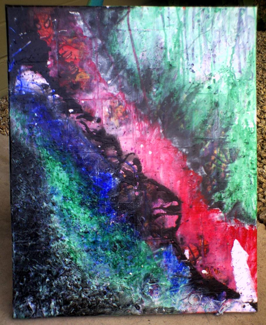
I got so into Marvel Team-Up #2 that I cut up a copy in really poor condition I got for fifty cents. It’s a crazy expensive comic in better condition, but it retails for about $5 in the condition I found it. I definitely got more than $5 worth of artistic inspiration from it, doing a few other ink studies and also the first painting in my 2013 dream journal series which has a partially visible underlayer of panels concerning the argument between Spidey and Torch, a battle not just for their bodies and their minds but the very essence of their friendship.
Dream Journal #1: Anger
Panels of their conflict fill the angry rift running from the upper left corner to the bottom right of the painting. Over them, I painted and textured layer after layer, including found objects from small pieces of hardware to a dead, dehydrated lizard I found on my porch, adding color washes until they became like a soothing balm for the raging argument below, brushing and pouring and splashing until a peace came over me and I knew that despite what had happened to them, Spidey and Torch would be okay. Their lives and friendship had been torn apart by anger, but they would heal. Their friendship would heal.
In that sense, the painting became a way for me to work though some dark things that had come up in my dreams until I could see the light again. It wasn’t just about anger, as I later titled it. It was about regaining one’s senses and overcoming that emotional disruption.
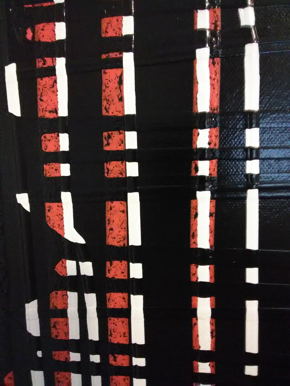
Another of my dream journal series of paintings began as a collage of the same issue’s cover and random interior images, plus a few add-ins from other comics I was sacrificing on the altar of art at that time, including beat-up copies of Marvel Team-Up#5 and #16. The central panel is a John Byrne and Karl Kesel illustration from a six-issue DC series in the 1980s called Legends.
Collage of comic book panels on canvas.
Spidey’s dialogue “Face it, creeps! This is the pay-off!” appears twice, which suggests I had not one but two copies of Marvel Team-Up #2. But maybe the second occurrence comes from a different and far less expensive Spider-man reprint issue, from which I repurposed a bunch of pages.
Later, I added more and more layers of paint and texture until the original collage was almost entirely obscured. The collage centered on a panel where a character thought, “Perfect! The master will be well-pleased!” Over the years, I kept adding to the canvas, trying to bring it closer to some perfect form. I awoke one morning to see what I had wrought upon the canvas in an inebriated, late-night state.
Dream Journal #9: Perfection
“Perfect,” I said. “Perfect!” Then I laughed like a maniac, probably convincing my neighbors that a real-life supervillain lived next door, because I could not keep a straight face while trying to say, “The master will be well-pleased.”
Years later, I still say this to myself when I feel stressed about some artistic decision. It makes me laugh and reminds me to not take things so dreadfully seriously. But I’ve also learned to build in a buffer of time to step away from decisions made in anger or fear before carrying them out, then come back to them a day or two later with a fresh perspective.
Do I see improvements I could make before acting? Have I realized some potentially negative outcomes I didn’t consider before? Could I improve the ways I plan on communicating with others about the situation? Do I need to do some research to back up my convictions or expose places where I might be wrong?
Then let’s attend to those things now, before we damage friendships and end up punching each other’s lights out in some science-fiction hallway where our actions only serve the villains who seek to destroy us.
Collector’s Guide: The original issue appeared as Marvel Team-Up #2 in 1972 from Marvel Comics. It was reprinted in the far less expensive Spider-man Megazine #2, which you can get for about $2. It also appears in black-and-white in the Essential Marvel Team-Up, Volume 1.
I recently shared a couple poems from the 1985 illustrated edition of Pablo Neruda’s poetry collection Art of Birds. I guess I got lucky last year, scoring an old library copy for less than $20, because prices on any edition of this book are now pretty steep. Here are four of Jack Unruh‘s bird drawings that accompany Jack Schmitt’s translations of the poems.
Joe Shenton got his Kickstarter funded for his current book project, and on Tuesday I received an awesome ink drawing from him. My modest contribution earned me a steampunk monster drawn in the style that will appear in his book, with the option to choose what the monster would be based on. I requested an electric eel, and Joe delivered!
UPDATE: You can now buy a high-quality print of this piece fromJoe’s Etsy Shop!
JULY 30 UPDATE: I’m pleased to report this project was fully funded! ~M
Last year, Joe Shenton sent me original artwork for supporting a Kickstarter campaign. I told him I like outer space, pirates, and octopuses, and he created a drawing I absolutely love. UPDATE: You can now buy a high-quality print of this piece fromJoe’s Etsy Shop!
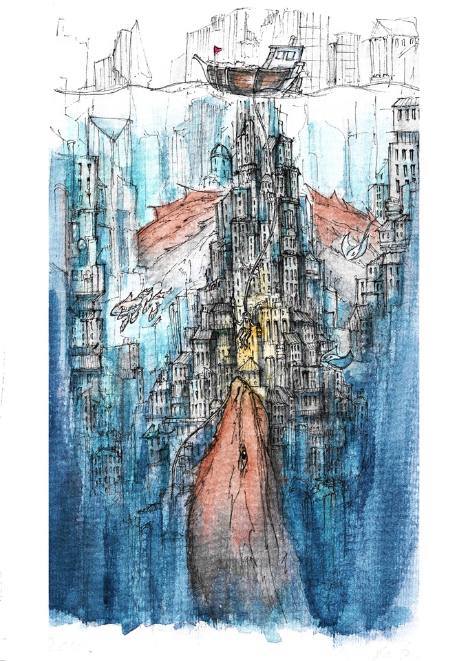
This year, Joe is working on something a little different: producing an illustrated book with an original story, and adding watercolor paints to his ink drawings.
The Last Forest will be a tale about a boy and his fox caught up in a conflict between nature and industry in a future world Joe’s creating by blending fantasy, steampunk, and science fiction.
Here are a couple images from the project’s Kickstarter page. If you like what you see, head over to Joe’s Last Forest Kickstarter Campaign and show him your support! Get there before July 27, because the campaign ends soon.
Working with color has always been a challenge, because I have a form of red-green colorblindness. According to a recent test, my specific variation comes from weak green receptors. Green isn’t the only thing affected; I have trouble distinguishing some purples from blues, light pinks from white, browns from greens, and many more. But guess what?
Mountains; acrylic on canvas, 24×30
I love playing with color anyway. I still see it. My world isn’t black-and-white. That would be an even more extreme colorblindness. Mine is like color “confusion” compared to that. But because color remains a challenge, I was thrilled to learn Bob Ross recorded a landscape painting demonstration designed just for colorblind artists. It’s very much like his other work, but all in one color: a grey tone mixed with white to create lighter values.
I watched it twice in a row, utterly mesmerized, and then tried my hand at his techniques on a much larger canvas with acrylic paint. Ross used oil, and many of his techniques don’t translate to acrylic. Acrylic dries faster, so you don’t have the luxury of blending as smoothly as Ross did with oil.
On the other hand, you can do a few things with acrylics that Ross never did with oil: layers of color washes, splashes, and other “wet” effects you get from making a mess with water and paint. My art teacher loved Payne’s Grey and first suggested it to me as a color for painting the mountains in Sedona at night, just at the end of sunset. I love it too, and when the little tube she gave me ran out, I bought 250ml of the stuff. Payne’s Grey is the only paint I used in this piece, plus white: an ultra-white interior house paint (semi-gloss) from the hardware store.
Ross uttered an especially memorable line in his monochromatic demonstration of building mountains: “All you need is a dream in your heart. And an almighty knife.”
One of the neighbors moved out and left behind a 36×12 canvas with a generic photo print of a flower on it. Time to break out the acrylic paints and texture media!
No actual mermaids appear in this abstract painting, but it was the last wash of turquoise that made me think it might be the kind of place they’d like to swim. The other two colors are quinacridone magenta and ultramarine violet. The colors are liquid acrylics from Golden, and the black and white layers underneath are semi-gloss acrylic house paint. A couple coats of gloss varnish from now, she’ll be decorating the wall. 15 x 30 in., acrylic on canvas.
Perpendiculars. 24 x 30; acrylic poured on canvas.
No, it doesn’t require much technique, but it’s a fun way to cover a few square feet of empty wall. I did this as a sequel to Parallels since I had leftover paint.
Blue & White Nebula. Created on an 8×10 canvas mounted on board. Using a trowel, I smeared on a thick layer of white semi-gloss acrylic house paint and let it dry. Then I sprayed it with water and dropped Golden brand liquid acrylic artist paint, in Prussian Blue. It made these interesting patterns as it diffused through the water. Now let’s have some rock from the band Nebula, from the Nebula/LowRider split album:
I’ve been experimenting with a new method of creating colorful, visually interesting backgrounds for things like book covers, business cards, and blog headers. It begins with painting 8 x 11 canvasses which are mounted on a board instead of a frame. They fit nicely on my scanner, so I can digitally manipulate the images later. This one began as a collage of pages torn from a proof copy of my new poetry book. It ended up as the cover to a new book.
Throw a filter and text on it, and it comes out like this:
It looks pretty awesome in print with a matte finish. Once I get a few good scans, the canvases can be recycled by adding layers of different materials to create cracks, swirls, and other interesting textures. Below is the same canvas as above, but in the process of getting a new, messy layer of krackle over it.
Here’s one I haven’t used for any backgrounds yet, a basic color wash with acrylics.
I had some old acrylic varnish and played around with pouring it and liquid paint at the same time, splashing water on them while they were drying, and mixing them together before pouring.
It isn’t going to hang in a museum or anything, but it’s a fun way to get unique backgrounds and textures. I sampled a section of the image for the current header on this blog. The image’s right half is simply a section of the canvas with its colors inverted.
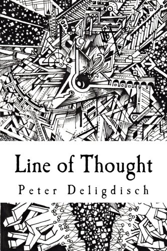
Line of Thought by Peter Deligdisch is long overdue for a spotlight here at Mars Will Send No More. For maybe two years now, Line of Thought has inspired me. Filled with complex and often abstract drawings, this completely black and white book gives me an instant trip to an art museum. It’s the cup of ink-black coffee that wakes me up when my artistic spirit is lagging.
Maybe you’ve already discovered Peter’s artwork on YouTube or, like me, on Reddit. Line of Thought collects many of his more polished works alongside a few odds and ends that make the book feel like an intimate look at the artist’s sketchbook. I like that kind of thing, but some reviewers criticized the book for not being print-quality reproductions and for including what they felt were doodles.
I enjoy Line of Thought‘s resemblance to underground and indie comics, and to zines, and to publications like Seattle’s Intruder which is entirely comics and art. (Intruder will soon publish its final issue after a pretty amazing run.) This book fits right in with works such as Rick Griffin’s Man from Utopia. It’s an art book, and I think my fellow comic book fans might dig it, too.
Peter works in several distinct styles, but most of his work fits in with what have recently been called zentangles. They are ornately detailed renderings of the plane along shapes which can be either swirling and chaotic, or geometric and orderly. You can make a zentangle out of something representational, or it can be abstract. And when you see Peter’s ink drawings, you can’t help but imagine coloring in all the tiny shapes.
Although I love this book, it may be a mistake to have it categorized in the coloring books category. It got some negative reviews for not really being a coloring book, and that sounds fair. On the other hand, many of the pieces in Line of Thought could totally work as coloring book pages, with a few alterations to the current format. That might include enlarging many of the pieces currently filling half a page (and thus sharing it with another piece). And, pieces with grey-scale shading could be omitted in favor of only pieces created in high-contrast black and white.
That’s not to say it would make me love the book any more, but it would position Deligdisch more accurately in the coloring books category. I’m perfectly content to pick up Line of Thought and flip through the pages whenever I need a reminder that anything is possible in art, that both chaos and order are beautiful and intertwined, and that it’s possible to create pure magic with only a pen and a piece of paper.
Making art quickly makes chaos out of your walls. Things get hung at random and, over the course of a year, lose all sense of order. Closing out 2015 required a bit of wall patching, cleaning, painting, and re-hanging.
Yesterday saw the arrival of the proof copy of a music album I’ll be publishing this month. The artwork, which I designed using scans of an acrylic painting and an ink drawing, came out really nice. 2022 Update: This compact disc went out of print in June 2021 due to changes at Amazon, but you can download it for free as an MP3 album from this blog’s Music Albums page.
I don’t do the tree thing in December, but the art studio desperately needed some suitable greenery. Here in the desert, we get ordinary house flies all year long, even in the winter. Otherwise the weather is so nice you can open windows and doors and let the cat come and go as she pleases and enjoy the sunlight and play guitar on the porch and… then the flies. It doesn’t take but a couple in the house to drive me mad. But, when life gives you flies, grow Venus flytraps.
Nothing says seasonal festivity like a carnivorous plant. I ordered this one on eBay from “Joe’s Carnivorous Plants”. She just ate her first fly yesterday. I was so proud. The leaves are thin enough that when the sun shines on them you can see the pesky little fly trapped in there.
That should keep the freshly cleaned and organized sketch room from devolving into pestilence and infestation for another year! Go, little flytrap!
Every year, the Burton Barr Library, the main hub of the Phoenix Public Library system, dedicates its first-floor art gallery to a Dia De Los Muertos exhibit. The exhibit presents altars made by locals in remembrance of family, friends, and others who inspired and influenced the altars’ creators before dying. This year’s exhibit features not only tributes to artists like Jim Henson, Salvador Dali, Sylvia Plath, and Shel Silverstein, but also memorials to grandparents, cousins, and co-workers.
The brightly-colored altars contain images and objects of meaning to the departed, from books they loved to food they liked, from memorabilia of their favorite sports teams to images and quotes that meant something to them. Every altar has an artist’s statement about what the departed meant to them on a very personal level. These are intimate statements, and one cannot help but be moved by their candor and affection.
Traditional motifs of Dia De Los Muertos abound: multi-colored paper marigolds, candy skulls, and sculptures of people and animals painted black and then painted over with skeletons. The exhibit always contains a piece where people have written names and messages on bright paper butterflies and hung them on lines stretched below a colorful arch of paper marigolds. I imagine the butterflies are symbols of transformation, and also flight and rising above—a deep contrast to the familiar Halloween imagery of graveyards and haunted houses where spirits remain trapped.
Halloween holds little appeal for me. Halloween focuses on fright and creepiness. Halloween imagines the dead come back to haunt us. Halloween portrays the dead as tortured souls come back from the grave to share their torment with us. Perhaps that is one way people confront their fears of death.
But Dia De Los Muertos imagines the dead quite differently. Rather than the dark and gloomy colors of Halloween, Dia De Los Muertos revels in color and brightness. Dia De Los Muertos imagines the dead continuing to do the things they loved to do in life. The dead joyously ride bicycles, make art, love their pets, and play musical instruments. Los Muertos are quite happy, and the day celebrates the joy and love they felt in life—and that we felt for them.
So, I like to make an annual trip to Burton Barr to see this exhibit. I always find it profoundly moving in the way it celebrates those who have died. Though tinged with sadness, the altars focus on why we loved those we have lost, and what brought them joy while they were alive. This year, I took my camera phone to snap a few shots for this blog, but then had second thoughts.
Instead, I took one of many copies of the Lakota prayer, scanned below, from one of the altars. I did not know Carole, but she worked in the public library system here, and worked in libraries all her adult life. Her multi-level altar—created collaboratively by friends, family, and co-workers—includes a diorama of Carole in skeletal regalia seated in a comfortable chair, watching her favorite sports team on television, surrounded by shelves of books and the pets she loved in this life. Above this diorama is a poem composed for her. It tells of her life and her eventual death from cancer. It mourns her passing but celebrates her life. If, as the mythology of Dia De Los Muertos says, the dead do gain permission one day each year to visit their living loved ones, then I have no doubt Carole would be touched to find the exhibit made in her honor. I found the following verse much more meaningful than any spooky and scary Halloween imagery.
Oak Toad on a Leaf. Micron 05 and 01 fine point pen.
And that’s it for my drawing pad of 6×8 paper! Though I have a couple other blank sketchbooks waiting, I might get another 6×8 pad to have around. I like working in this size for several reasons. One, it takes less time to go from concept to completion than it does with a 9×12 drawing. Two, the dimensions make it easier to crop to a 5×7 aspect ratio for custom-printed greeting cards. Three, I can find mats and frames for a much more reasonable price at this size, compared to the relatively exorbitant cost of matting a 9×12 to an 11×14 frame. And four, since I draw all my mid-tone lines by hand without a ruler, it is less challenging to cover large areas of the drawing than it is in a 9×12. Just try drawing hundreds of straight lines across a 9×12 sheet of paper sometime, and you’ll see what I mean!
Like last week’s damselfly, this toad had as its photo reference one of my mother’s recent nature photographs. She’s taken some especially crisp and detailed photos of small animals lately, and it’s been fun using them as inspiration for opportunities to practice inking with fine point pens.


 mockingbird digital study: high contrast, pencil rendering, transparent color layers.


