One of the neighbors moved out and left behind a 36×12 canvas with a generic photo print of a flower on it. Time to break out the acrylic paints and texture media!


14 Sunday May 2017
Posted in art studio
16 Sunday Apr 2017
Posted in art studio
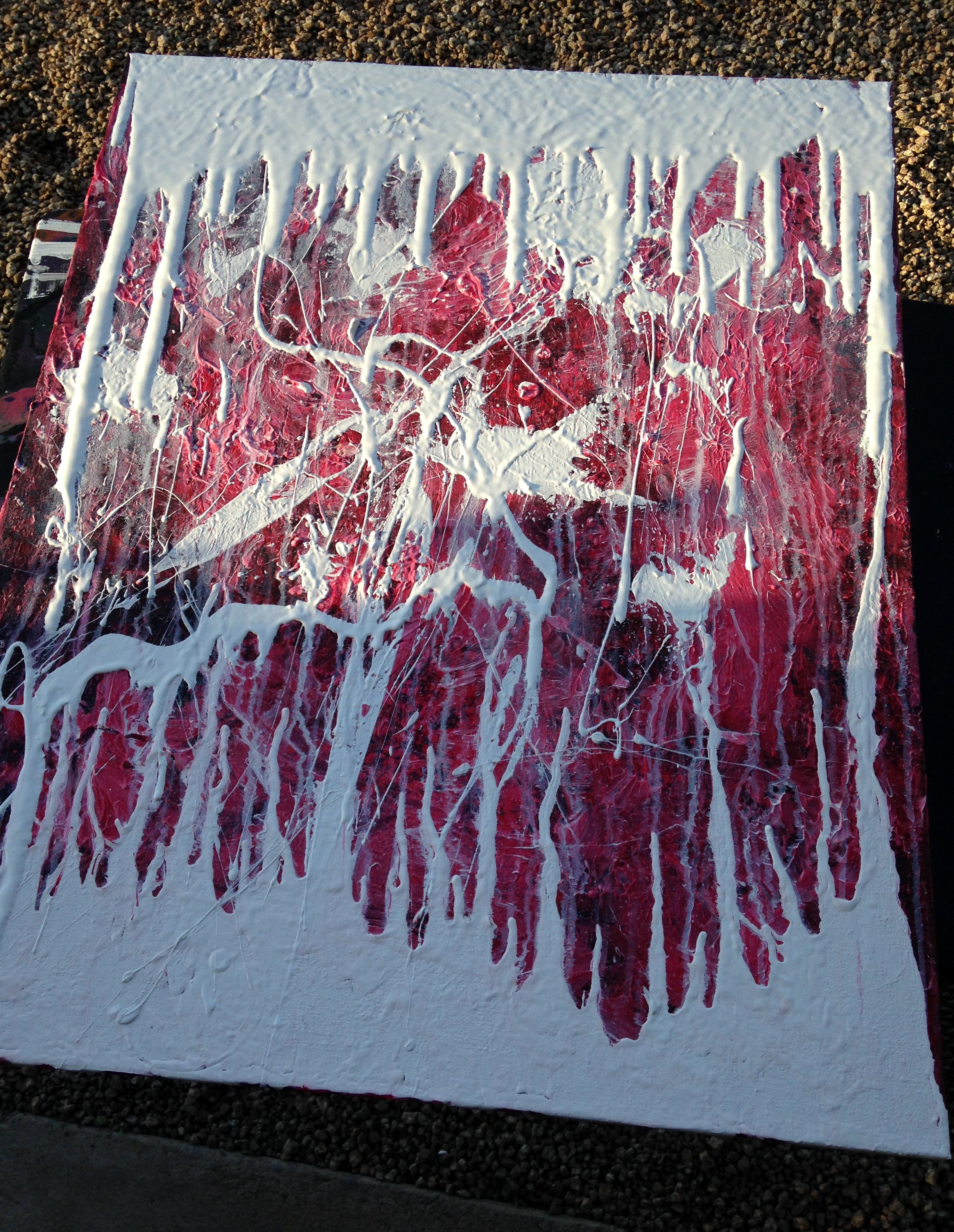
No actual mermaids appear in this abstract painting, but it was the last wash of turquoise that made me think it might be the kind of place they’d like to swim. The other two colors are quinacridone magenta and ultramarine violet. The colors are liquid acrylics from Golden, and the black and white layers underneath are semi-gloss acrylic house paint. A couple coats of gloss varnish from now, she’ll be decorating the wall. 15 x 30 in., acrylic on canvas.


21 Tuesday Mar 2017
Posted in art studio
Tags
abstract, acrylic, art, painting, perpendiculars, poured paint

Perpendiculars. 24 x 30; acrylic poured on canvas.
No, it doesn’t require much technique, but it’s a fun way to cover a few square feet of empty wall. I did this as a sequel to Parallels since I had leftover paint.
25 Saturday Feb 2017
Posted in art studio
30 Friday Dec 2016
Posted in art studio
21 Wednesday Dec 2016
Posted in art studio

Blue & White Nebula. Created on an 8×10 canvas mounted on board. Using a trowel, I smeared on a thick layer of white semi-gloss acrylic house paint and let it dry. Then I sprayed it with water and dropped Golden brand liquid acrylic artist paint, in Prussian Blue. It made these interesting patterns as it diffused through the water. Now let’s have some rock from the band Nebula, from the Nebula/LowRider split album:
27 Thursday Oct 2016
Posted in art studio
Tags
abstract, acrylic, art, book covers, collage, making books, painting, textures
I’ve been experimenting with a new method of creating colorful, visually interesting backgrounds for things like book covers, business cards, and blog headers. It begins with painting 8 x 11 canvasses which are mounted on a board instead of a frame. They fit nicely on my scanner, so I can digitally manipulate the images later. This one began as a collage of pages torn from a proof copy of my new poetry book. It ended up as the cover to a new book.

Throw a filter and text on it, and it comes out like this:

It looks pretty awesome in print with a matte finish. Once I get a few good scans, the canvases can be recycled by adding layers of different materials to create cracks, swirls, and other interesting textures. Below is the same canvas as above, but in the process of getting a new, messy layer of krackle over it.

Here’s one I haven’t used for any backgrounds yet, a basic color wash with acrylics.

I had some old acrylic varnish and played around with pouring it and liquid paint at the same time, splashing water on them while they were drying, and mixing them together before pouring.

It isn’t going to hang in a museum or anything, but it’s a fun way to get unique backgrounds and textures. I sampled a section of the image for the current header on this blog. The image’s right half is simply a section of the canvas with its colors inverted.
10 Monday Oct 2016


Posted by Mars Will Send No More | Filed under art studio
11 Friday Jul 2014
Posted in art studio
We sold two paintings today. We had our doubts that anything would ever sell due to a Craigslist ad, but we were happily proven wrong.
Guitar #20: Frozen Coast caught an art lover’s eye on Craigslist. While she was here, she took a liking to Dream Journal #8: Night at the Lake. Good choice! We are very fond of that one, and miss it already.

You can read more about Guitar #20, or Dream Journal #8, in our archives. Their original posts include detailed close-up photos.

04 Sunday May 2014
Posted in art studio
Guitar #20: Frozen Coast
Acrylic paint, varnish, and texture media on gallery-wrapped canvas
24 x 30 in. (60.9 x 76.2 cm)
Colors: Prussian blue, anthraquinone blue, deep permanent green, white, black.
This painting is currently for sale on eBay SOLD.
I enjoy working at this size, even though building up the layers of color and texture on something this size takes approximately forever. Below, you’ll see a bunch of close-ups that show just how textured this piece is. The last half-dozen or so pics illustrate its long journey from blank canvas to colorfully tactile art.


As promised, some “in progress” photos. Yes, we did start off thinking this would be red, but got wonderfully sidetracked by blue instead.


11 Saturday Jan 2014
Posted in art studio
Tags
abstract, acrylic, art, collage, dream journal, dreams, mixed media, painting
Dream Journal Eight: Night at the Lake. Acrylic paint, varnish, and mixed media collage on canvas
12 x 12 in. heavy duty frame, 1.5 in. deep.
Our Dream Journal series combines collage, print media, found objects, and acrylic paint to make deeply personal expressions.
Night at the Lake recalls a memory of a dream, a dream written on pages collaged into the layers of this piece. At night, you and your love swim in this lake. Silent fish drift by in the deep waters. The clouds part their fingers to reveal the full moon at its apex above the forest. The two of you tread water together, then dive.
Tiny metal beads adorn the surface of Night at the Lake, finished with several coats gloss varnish for durability and protection, resulting in a glass-like finish. The signature appears on the back of this original piece.


02 Thursday Jan 2014
Posted in art studio


Sedona Sunset. acrylic on 40 x 16 in. canvas.
Inspiration for Sedona Sunset comes from the color of the sky and mountains in the Arizona desert in the last glow from the sun setting behind them. Deep violets, blues, purples, and Payne’s grey express both the natural splendor and the warmth of this popular Arizona destination.
Renowned for its scenic views and spiritual vibe, Sedona attracts many seekers and explorers. Yet, its ancient hills, streams, and rock formations give it a timeless quality that endures long after its visitors move on.
The edges all around this 1.5 in. deep professional wood frame are fully painted and varnished, making this piece attractive from any point of view, without an additional frame. Numerous coats of high-gloss acrylic varnish give it a glassy finish and bring out the brightness in its dark but vibrant tones.


01 Wednesday Jan 2014
Posted in art studio
31 Thursday Oct 2013
Posted in art studio

Guitar 5. 11×14 in. canvas. Acrylic paint, texture media, and varnish with metal leafing.
Guitar 5 started out as something else entirely. Twice. Maybe three times. Sometimes, you run experiments, and they fail. Many of us fall into the trap of not experimenting or trying new things simply to avoid that failure. In life, people often respond to failure with powerful emotions of frustration, grief, or even guilt. But if you approach life like a scientist, you know you need to run lots of experiments to learn anything meaningful.
On the canvas, as in life, we need the freedom to explore and experiment. Learning and advancing never come to us without falling on our face a few times – just like when we learned to walk. Where would we be now if we had given up the first few times we failed to get on our feet?
I used to paint houses instead of canvases. Running my own painting crew included finding work for them. To find work, I walked from door to door all over the city of Ann Arbor, MI. My days often consisted of being told no and having doors shut in my face. But, enough people said yes that I was able to employ my crews, or at least find enough solo work to feed myself. My experience landed me a job with a professional crew that came out at my request to fix one of my crew’s mistakes. I had a great working relationship with them for years, and learned a lot.
In the end, people congratulated me on my success. I worked for myself, set my own hours, and got good enough at refinishing decks that I only had to work about 3-4 days per week in the summer.
What does that have to do with painting canvases? Take Guitar 5, for example. It told me no several times. It shot down a lot of what seemed like good ideas. But, I kept coming back to knock on its door. I ran some experiments on it and just had fun with it. What happens if we try…. this? Or that? In the end, it wasn’t what I set out to do — but it ended up rocking anyway.
As you can see in the detail below, a rich, complex, colorful surface resulted. My experiments with Croma Krackle led to even more confident use of this texture media in Guitar 7. I discovered some different ways to use water and alcohol in color washes, which served well for Guitar 15.
I’m glad I kept going.


31 Thursday Oct 2013
Posted in art studio

Guitar Thirteen. 10×10 in., Acrylic paint & varnish on canvas.

When I lived and worked in San Diego and La Jolla in 2000 and 2001, every corporate office had some kind of art based on beaches and palm trees. On the one hand, it got to be cliche. On the other hand, I was inspired by all the different ways artists chose to represent these themes.
I pay tribute to those inspirations with Guitar Thirteen. Using blues and greens that remind me of La Jolla, and some paint scraping techniques I picked up from a video on Gerhard Richter, Guitar Thirteen abstracts all my pleasant memories of living in Southern California. The square shapes bring to mind the buildings. And, if you look hard enough, you might even see some highly abstracted palm trees on the left!

26 Saturday Oct 2013
Posted in art studio

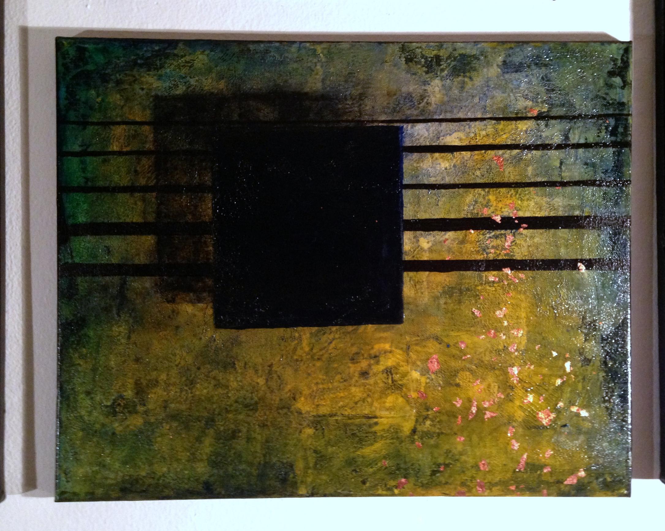
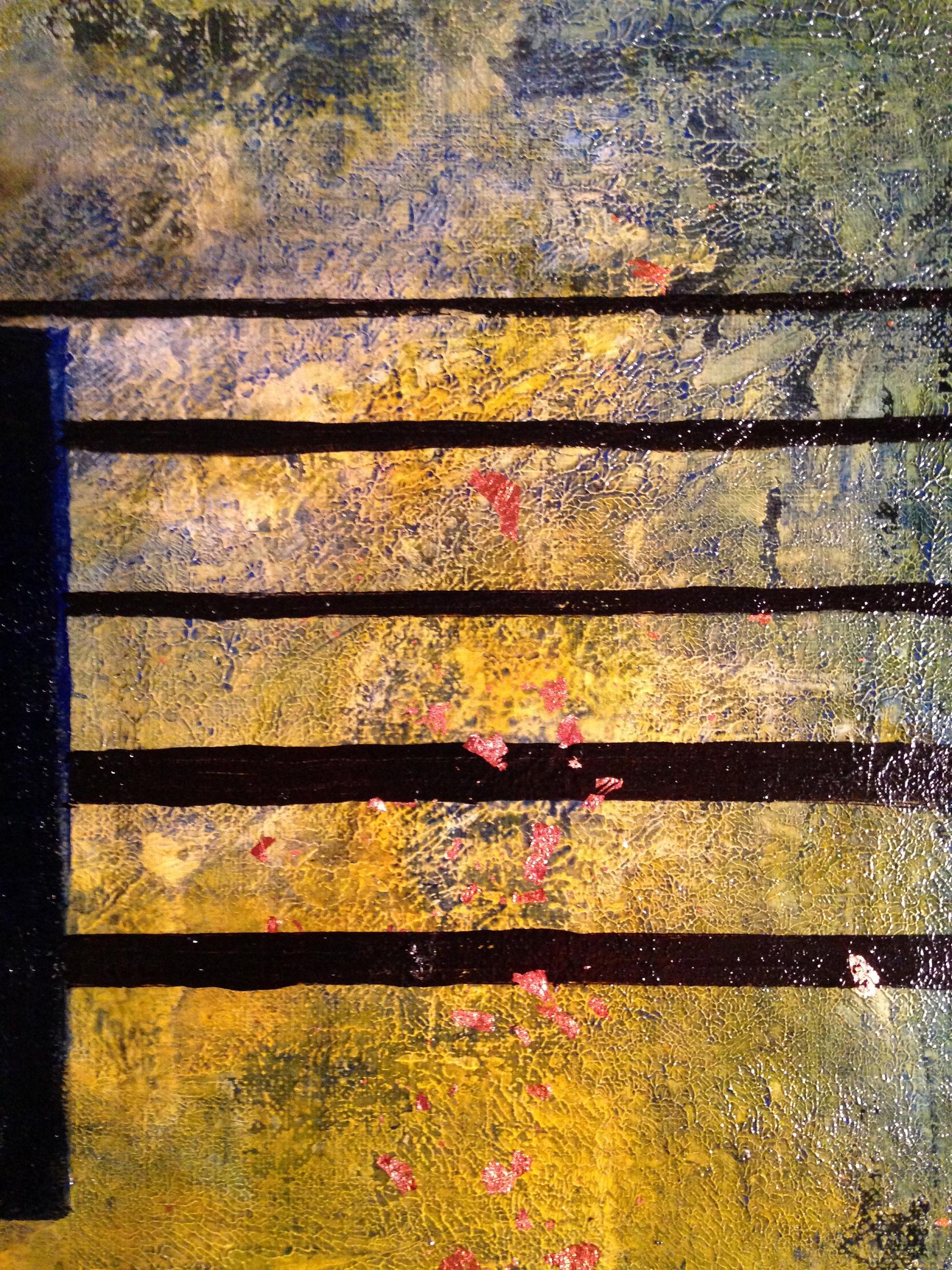
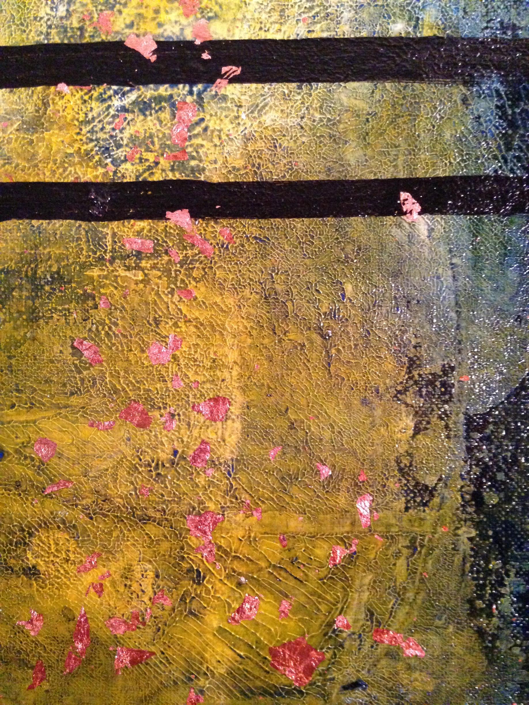
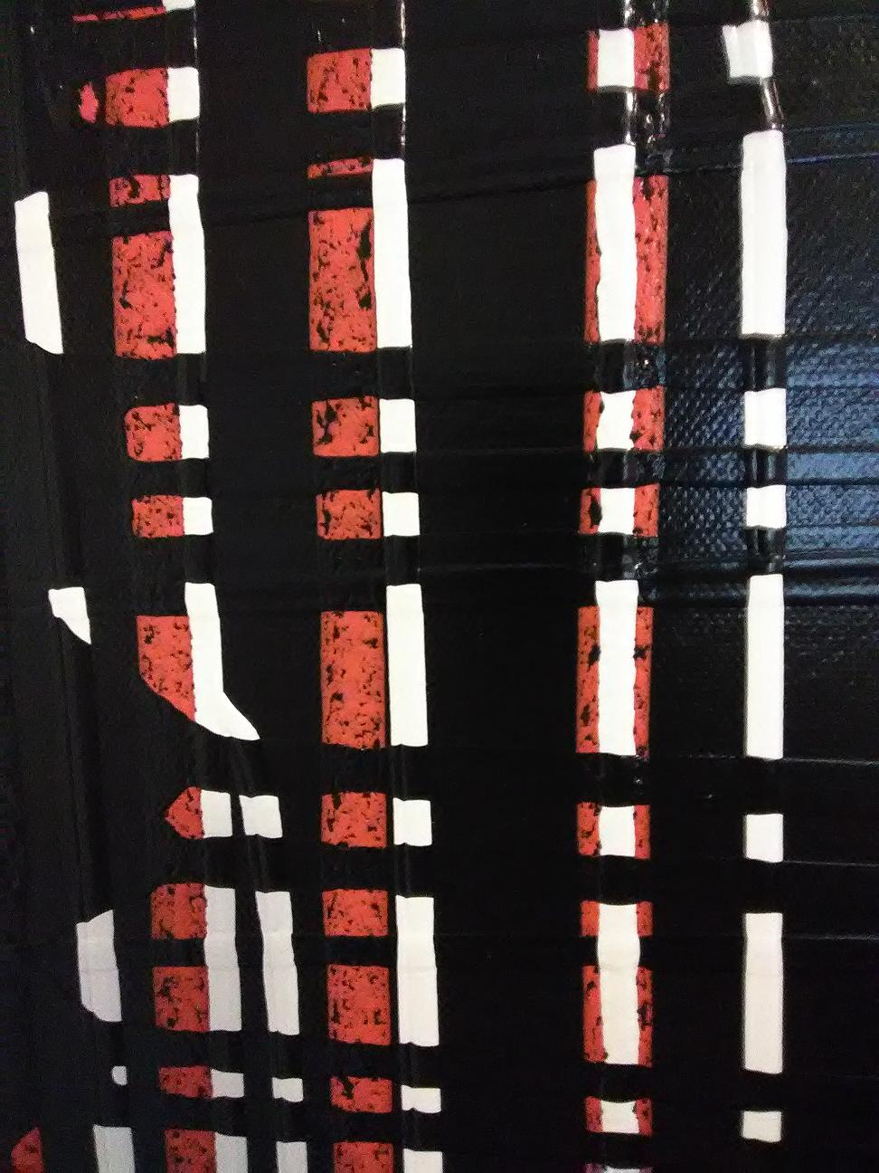
Guitar Fifteen. 10 x 10 in., Acrylic paint, media, and varnish on canvas.


You might be interested to see how we built up this painting layer by layer. Below, you can see some of the lower layers of the painting. Using Ultra White and Titan Buff in a composed arrangement, then letting them bleed together and/or separate, created a rich and varied wash. Below that layer, a thick series of washes makes a nearly solid dark purple background. Putting light colors on top of that will let the colors of our top layers shine.

Next we blocked out the shape in white, because white paint covers better than anything else. It will get a couple coats of white and then one of black before we move to the final layers. At this point we almost went with copper for the background, but our art teacher suggested silver. Good call.

Below, you can see our shiny new palette knife coated with silver paint and ready for action. We applied a mix of Payne’s Grey and Silver. We dipped our knife in each color separately, then blended them on the canvas. Next, we crumpled up a plastic bag and smooshed it onto the surface. When lifted, it creates an interesting raised texture. You might see interior decorators do ‘faux finishes’ with similar tools, like a sponge or rag.

As a final step, we went along the outline with Payne’s Grey, pulling out the excess paint into the dried silver area to create something like a glow. After two coats of varnish, it truly does seem to glow in natural light.


25 Friday Oct 2013
Posted in art studio


Modern Heart Two. 16 x 20 in., Acrylic paint, media, and varnish on canvas.
Modern Heart Two began as a purely abstract piece, which you can see below.

Then, we shaped the heart, filling in the negative space with deep maroon and black. Here you can see the wet paint mixed directly on the canvas with a palette knife.


23 Wednesday Oct 2013
Posted in art studio

Guitar Fourteen. 16 x 20 in., Acrylic paint, media, and varnish on canvas.
Guitar Fourteen celebrates the unique shape of a double neck guitar. Its rough surface texture and lightning strikes of color across the body suggest energy, electricity, and power.
Gibson’s double neck SG electric guitar became well-known in the 1970s when Jimmy Page used it in concert performances of Stairway to Heaven. About that same time, John Mclaughlin broadened its popularity in his pioneering jazz/rock fusion band, Mahavishnu Orchestra. Why do they have two necks? One has twelve strings, and one has six! Page typically used the twelve string for the pretty chords of the first part of Stairway, switching to the six string for the power chords and guitar solo at the end. The SG’s distinctive double cut-away, often imagined as horns, gives the guitarist unimpeded access to the highest frets on the neck.


Guitars with two necks came into being well before the 1970s. Junior Brown, for example, plays his aggressive brand of Hendrix-flavored country licks on a double neck guitar of his own design. His incorporates a standard electric guitar neck with a second neck set up for slide guitar playing, the kind you would expect to see on a pedal steel guitar.


Even farther back in time, unique instruments called harp guitars added sets of unfretted strings to the guitar’s standard set. Gibson in particular blended harp guitars and regular acoustic guitars into some interesting double neck designs. You can find many of them on eBay at collector’s prives these days. If you want to see them in action, check out the Harp Guitar Society. Phoenix guitar virtuoso Bill Dutcher often performs with a harp guitar and recorded a track for one of the Society’s compilation albums.

Guitar Fourteen began as a purely abstract piece. Here you can see it before it became a guitar:

It also went through several stages before the final background. Here you can see it in the stage we almost decided on, with a darker background of deep grey.

07 Monday Oct 2013
Posted in art studio

Guitar Seven. Two 10×10 sections; Acrylic paint, media, and varnish on canvas.
I get a bit sentimental about the layers that go into one of my guitar abstracts. Today’s post shows you the stages of my latest one, along with some thoughts on creation and destruction in the process of making it. Besides acrylic paint, I used Kroma Crackle to get the crackly white effects. It isn’t Kirby Krackle in a tube, but it’s still pretty awesome.


Usually we think of art as a creative process, but art also destroys. In other words, making art requires destruction. We also think of these as two different things most of the time, creating and destroying. But really, they represent two aspects of a single, unifying force: transformation.
I like to build rich, complex layers of texture and color into my guitar abstracts. That process, combined with blacking out the silhouettes, requires the obliteration of some things that looked pretty cool to begin with. Every time you add a layer, you bury some of the previous layers. You create something beautiful, and then you destroy parts of it.
My art teacher warns about the trap of falling in love with your backgrounds. If you do, you will never end up bringing the subject to life. Maybe an especially colorful or interesting thing happens during a layer. Before the next layer goes on, you stop and wonder, “Should I just leave it alone? What if I wreck the pretty part that already exists?” Some people will stop right there and just leave it. Afraid to risk destruction, they shy away from taking things as far as they can go.
You make that personal choice. No one made it mandatory to go all the way in life or art. But, I like the thrill of taking it further to see what happens. I like to think about how no one ever cared about that little splash of color that catches my eye as I go to cover it up. That patch of incredible texture never had any love from anyone. But for one brief moment, it mattered. For a short time, it meant enough that the thought of losing it mattered to someone.
And then, I sacrifice it to the true subject of the painting. It dies to bring out the beauty of the true subject, but its brief existence and loss have meaning. In the end, when the subject stands revealed, it carries all those meaningful moments with it. They helped bring it to life. The meaning they brought to the piece lives on with it. Both created and destroyed, they live on: transformed.
28 Sunday Jul 2013
Posted in art studio

It’s the worst time of year to go walking in Scottsdale looking at galleries and the SMOCA (scottsdale museum of contemporary art). It’s 115 degrees Fahrenheit in the shade, and humid as a motherfucker. On the upside, no one else is crazy enough to be there in this weather. You can talk at length to the people who run these galleries, and the sidewalks are clear. Which is nice, because you may have to pass out on them. Anyways, the point is that we stuffed our brains full of high-priced abstract art and then came home to paint our impressions of it. All of it, at the same time.


15 Monday Jul 2013
Posted in art studio

A pretty awesome thing happened at Martian Headquarters last week. We spent the better part of a day studying techniques for washes of color with acrylic paint. This hands-on experience was a slice of art heaven for us, and only convinced us more of our teacher’s genius.
We have been experimenting a bit, tracing outlines of guitars over them. It’s fun, and they look nice on the wall. They seem to work because A) the washes are pretty and B) people can latch onto the concrete idea of the guitar instead of being lost in abstraction. Dig some in-progress shots of pieces that are busy drying or getting additional coats, plus some details of the washes.


13 Saturday Jul 2013
Posted in art studio
13 Saturday Jul 2013
Posted in art studio
30 Sunday Jun 2013
Posted in postcards

This piece of marker art comes from our pen pal of paranoid postcards fame, an anarchist co-conspirator who keeps the jobs of postal workers so much more interesting. One of the best envelopes had a quote attributed to Bertolt Brecht: Art is not a mirror held up to reality but a hammer with which to shape it. We wouldn’t call it a total theory of art, but it gets you thinking about the ways in which you can transform your life and your world through art.
Live without dead time is a pretty awesome quote, too. What if every bit of your time on this planet was alive, creative, or meaningful? This piece reminds us and inspires us. We hung it near the drawing we put up instead of a clock.

26 Sunday May 2013
Posted in art studio