I recently got a great eBay deal on the comic book with my all-time favorite cover: Anna Mercury #2, the WizardWorld Chicago Convention variant, of which only 1500 were printed.
Anna Mercury is one of many short series Warren Ellis wrote for Avatar, including Black Summer, a brutal sci-fi adventure featuring my other all-time favorite cover: a wraparound by the same artist, Juan Jose Ryp.
The Anna Mercury story itself is just okay. It works best when it gives us every excuse to watch the leading lady kick all kinds of ass and do amazing stunts. With art pages like the following action sequence by Facundo Percio, I could be on board for just about any plot.
Anna seems to have it all: mega powers, mega weapons, mega awesome hair, and superb stunt skills. But although she has all these things in the alternate reality she struggles to rescue from oblivion, they are revealed to be an artifice when she returns to her own reality, where she is just a regular gal. Maybe Warren Ellis was making a comment on gamers and virtual world users, and the difference between our hyper-awesome cartoon identities and the hum-drum of everyday life.
As a writer of over-the-top adventures featuring an ass-kicking leading lady who also has huge hair, big guns, and major attitude problems, I absolutely love Anna’s aesthetic. When I hired an artist to do an illustration for the cover of The Second Omnibus, I sent him another brilliant Anna Mercury cover as a reference for the type of bodysuit Meteor Mags might wear, but embellished with stars and skulls.
Only a thousand of those were printed, and one of them arrived in my mailbox today. Stylistically, Anna’s been a big influence, and all I can say is that I hope Mags gets a movie deal before Anna does. May the best woman win.
Wolfskin is one of a couple dozen miniseries written by Warren Ellis for Avatar Press, a company founded in 1996 and which does not shy away from graphic violence, gore, vulgarity, nudity, and countless variant covers. You’ll find all five in Wolfskin, brought to life by artist Juan Jose Ryp, who collaborated with Ellis on several titles such as No Hero and my personal favorite, Black Summer.
Just in case anyone thought Avatar was publishing “family-friendly” books.
The titular, barbaric character hacks and slashes his way through a hell of a lot of people, occasionally pausing to rage against what he calls “machines”, which includes firearms and apparently anything mechanical. Wolfskin resembles Conan in his brute force and (questionably) superior moral code compared to the people around him, although Conan’s big gripe was not with machines but with sorcerers. And where Conan felt his god Crom was more or less disinterested in human affairs, Wolfskin’s god Wrod is available to assist with a lifeforce and power boost when Wolfie eats some magic mushrooms.
It wouldn’t be a Warren Ellis comic if someone didn’t take drugs and see god.
Wolfskin’s first three-issue series is a straightforward tale that revels in its own savagery. One of the things I find most amusing is Ellis’ take on the gratuitous shower scenes for women in basically every science fiction movie and plenty of superhero comics written by guys to indulge other guys in the “male gaze”. The better part of one issue consists of conversations Wolfskin has with a series of visitors while he bathes naked in a woodland river. He eventually steps out of the water for some full-frontal nudity featuring his uncircumcised dong that dwarfs even Dr. Manhattan’s bright blue wang.
You didn’t think I was going to post the dong page, did you?
I can’t help but feel Ellis and Ryp are satirizing pointless female bathing scenes, but it’s also funny because the poor guy can’t even wash up in peace without weirdos dropping by to pester him with their messed-up schemes and dubious stories—which is exactly how I feel as a bachelor who has his showers interrupted by everyone from landlords and maintenance people to neighbors and delivery drivers who can’t find someone else’s apartment without help.
Anyway, Wolfie gets so irate that he can’t even monologue, exposit, or make sound effects.
As long as we don’t have anything to read, let’s play Megadeth albums and look at pictures.
Wolfskin is the kind of bad-ass I love to read about, whether male or female, and he has a follow-up miniseries called Hundredth Dream in which he once again totally rages against the machines by destroying the hell out of them. Ryp didn’t draw that one, but the art still kicks ass.
Locals with a problem. This might require violence!
Hundredth Dream is also a straightforward tale of battle and bravery, but with a steampunk vibe thanks to technology that is at once futuristic and primitive.
Despite a few dialogue-heavy scenes, Ellis avoids the traditional narrative captions and expositional thought balloons of your typical superhero comic. Many pages are wordless, and sometimes Wolfskin goes several pages without saying much more than “Fuck!” I find it not only hilarious that Ellis got paid to write that dialogue, but also how much more realistic it feels compared to, for example, Chris Claremont’s X-Men characters who couldn’t walk down a simple flight of stairs without hundreds of words of self-examination, existential pondering, and plot summary floating around their heads.
He’s downright talkative on this page.
I’m not putting Claremont down; it’s just a totally different approach to scripting. Ellis scripts in a way that doesn’t so much direct his artists as it does unleash them. With a draftsman like Ryp, it’s probably best to just throw a couple scraps of raw meat at him and let him off the chain. Bryan Hitch, a longtime Ellis collaborator, once joked in an interview about how Ellis scripts have incredibly simple statements to cue the artist for massively complex splash panels, such as “The fleets engage.”
They sucker-punched me with expositional dialogue while I was enjoying the view!
If I had collaborators like Hitch and Ryp, I’d have them engage the fleets all day long. Their visual sensibilities are far beyond mine. The Ellis approach has undoubtedly infected my fiction. But instead of putting the descriptive burden on a penciller, I delegate that work to my third-person narrator, allowing him to paint a picture even if the dialogue is only a few profanities.
It just feels more real to me that way. When was the last time you injured yourself and launched into a longwinded exposition about your problems and what led up to them? Probably never. Like Wolfskin, you most likely exploded into some convenient curse words without much forethought. Maybe later, while talking to a friend, you explained for a couple hours about how your entire life story revolved around that injury. But in that case, you had crossed over into a Brian Michael Bendis comic! It certainly wasn’t Wolfskin!
Wolfskin and its Hundredth Dream sequel are like fun popcorn movies, just as long as you don’t mind getting blood all over your snacks. You won’t need to ponder the cosmic or bleeding-edge tech concepts Ellis employs in many other works. Just sit back, enjoy the mayhem, and savor every line of the ultra-detailed art. May Wrod have mercy on your soul!
Collector’s Guide:Wolfskin appears in single issues with variant covers to choose from. I especially enjoy Ryp’s wraparound covers. The standalone Annual also appears in a two-volume TPB that collects the first series plus all the single issues of Wolfskin: Hundredth Dream. Amazon has digital versions that collect the first series (including the Annual) and the second series.
Like last week’s pick from the short box of indie comics, this week features another crime story with a bad-ass female lead. Down is a four-issue series by Warren Ellis with art from Tony Harris and Cully Hamner, and its portrayal of a police officer infiltrating a violent criminal organization reminds me in some ways of one of my favorite films: The Departed by Martin Scorsese. Down isn’t quite as complex, as the fast pace and tight focus relentlessly blaze through the story up until the bitter end. But like The Departed, this story doesn’t end where you think it will.
Down puts our leading lady into the middle of a conflict between crooked cops and even more crooked gangsters, and every step of the journey takes her into increasingly questionable decisions about just whose side she is on. In her quest to get close to the criminal leader, she is forced to consider just how far she is willing to go to maintain her cover.
Down has a high body count and graphic violence, but I feel the real intensity takes place around just how much her experiences deform and re-define the protagonist’s conception of who she is and what role she wants to play in life. At some point, she realizes she has crossed a line she can never step back over and return to normalcy, and her only option is to choose a new path of her own design.
It’s one of my favorite of Ellis’ short works, and all the better because it doesn’t end with a big explosion, a convention he tended to over-use when he seemed to be cranking out a new series every week. It’s a fun read if you like crime fiction and bad-ass women, and you can get it for about $2 an issue.
This post is part of a series about what was inside this month’s big box of free comics.
What can I say about Planetary that hasn’t already been said in the 20 years since its first issue? From the series’ chronic delays of up to years between issues, to the Eisner-award-winning artwork, Planetary has been documented about as thoroughly as the weird events in Elijah Snow’s annual “Planetary Guides”.
The 864-page hardcover Omnibus edition looks like one of those Guides when you remove the slipcover, and that’s just one example of the high-quality design that was a hallmark of the series. People might have waited months or years for the original issues, but when each one finally came out, it looked damn good. So does the Omnibus.
Reading the Omnibus cover-to-cover puts Planetary in a fresh light. I gained a greater sense of the series’ continuity and complexity since I could read each chapter with the previous one still fresh in my mind. I got an even stronger impression of the amazing work by colorist Laura Martin (with assistance from Wildstorm FX). Although writer Warren Ellis and artist John Cassaday usually get the credit for the series, Martin’s contribution is integral to its visual splendor and the emotional effect of every page and panel. Maybe Planetary could have been good without Martin, but I doubt it would have been legendary.
The Omnibus also dissipates the major annoyance I had when I was originally piecing the series together from single issues; namely, a feeling that every installment consisted only of the three main characters visiting a random location where they met a random person who delivered lengthy exposition about a scenario based on pulp fiction or vintage superheroes, and that this exposition filled most of the pages before reaching a vague and hasty conclusion tacked on as an afterthought to the “cool concept” of the issue.
While several chapters do this, they are not as numerous as I remember, and they mostly take place in the beginning of the series. Reading the Omnibus makes it clear how the individual chapters fit into the big picture; it was just difficult to sort all that out with a series that took ten years to publish 27 issues, and because it was challenging to find affordable copies in complete chronological order if you came to the series late like I did.
Though I’ve thought highly of Planetary since the day I discovered a beat-up copy of #5 at a used bookstore, the Omnibus made me enjoy and appreciate it even more.
Buyer’s Guide: The Planetary Omnibus is sometimes out of stock at MyComicShop.com, but usually available on Amazon.
Now that films based on comic books and superheroes have firmly entered the mainstream of popular culture, characters and storylines we comics readers have enjoyed for years regularly come to life on the big screen for a wider audience than comics ever reached. Long-time readers are often thrilled to see their favorite heroes in live-action movies, but some feel a bit of regret. After all, it can be disheartening to hear people discussing characters as if the movies tell the entire story, when many readers have followed the characters in-depth for years or even decades.
Compressing years of story into a two-hour theater experience means a lot gets left out, as anyone who read the Planet Hulk stories can tell you about the movie Thor: Ragnarok, or anyone who read Marvel’s Civil War comics can tell you about the Captain America movie of the same name. Plus, the big screen and the printed page are two distinctly different mediums, each with its own storytelling conventions, so they deliver distinctly different stories.
Movies usually follow a formulaic narrative structure. From the inciting incident to the hero’s crisis, predicting the next story beat in a movie is pretty easy. Comic books often employ more flexible and unusual structures—a point in their favor in my opinion. This is true despite a trend toward making modern mainstream comic books more cinematic in their approach to storytelling.
Near the turn of the century, Warren Ellis used the term widescreen comics to describe the blockbuster-movie style he was creating in The Authority with artists Bryan Hitch and Paul Neary. After 12 issues, writer Mark Millar and artist Frank Quitely came on board and kept up the cinematic approach. Millar, Hitch, and Neary soon combined forces to reinvent the Avengers as The Ultimates—the forerunner of the current film versions of the Avengers. For a more in-depth look at widescreen comics, and how they influenced movies as much as movies influenced them, see Peter Suderman’s article for Vox.
As far as I’m concerned, there hasn’t been a movie yet that equals those first 29 issues of The Authority. But it’s more than just the awesome stories, vicious dialogue, and stunning artwork. What makes the printed page most enjoyable for me can be summed up in two words: time control.
In a film, time passes at a fixed speed determined by the flow of film through a projector, or its digital equivalent these days. Yes, a movie can use slow motion or speed up time, but all of that is determined by the movie itself. Moviegoers have no control of it in a theater. Time passes at a pace determined exclusively by the filmmakers.
With printed pages, the reader controls time. The reader determines how long to spend on a panel or page. Readers can turn back the pages to see something again if they did not absorb it on the first read. The reader can set the book down and walk away, then come back to it and pick up again from any point in the narrative. Movies only provide this convenience if you own or stream a copy at home and can rewind it or freeze the frames.
While I enjoy movies, I tend to enjoy their comic-book source material far more due to time control. An awesome action scene might be over in seconds or minutes on the big screen, but I can linger on it for as long as I like with a printed page. A stunning visual appears on the screen for fleeting moments, then moves on to the next one. It leaves me feeling unsatisfied when I want to spend more time taking in all its detail and beauty. With a comic book, I can pore over the artists’ rendering and take time to appreciate every line and shape, every bit of hard work that went into inking and coloring the picture. Instead of having it all fade away as I leave a theater, I can come back to it again and again with a book.
While many recent comic-book movies do look great, the awesomeness always go by too quickly for me. I never have a chance to fully appreciate it before its gone. And when the theater lights come on, fun time is over unless I want to buy another ticket. The experience is transient and ephemeral compared to a physical book I can keep for years.
None of this should be taken as an argument over which medium is “better”. Enjoy what you enjoy. This is only an attempt to articulate a feeling I’ve had for years but never explained very well to people who expect me to be super excited about recent superhero movies. It isn’t that the movies are bad; they simply lack one of the biggest things that gives me enjoyment with comic books: time control.
After 24 issues plus a Giant Size final issue, fan-favorites Joss Whedon and John Cassaday left some big shoes to fill on Marvel’s Astonishing X-men. This wasn’t the first time Marvel published an Astonishing X-men title, but it was much more artistically and critically successful than the one in 1995 or the one in 1999. To keep the momentum going after Whedon and Cassaday, Warren Ellis stepped up to bat, along with Simone Bianchi. Bianchi’s artwork on Wolverine’s solo title provided some glorious visual moments, including an eye-popping drama in Wakanda with the Black Panther, Storm, and Sabertooth. Ellis and Bianchi’s collaboration on X-men gives us some stunning wraparound covers and a convoluted but visually interesting story.
In a move that made sense to perhaps no one outside the marketing department, the first storyline spins off right in the middle to a two-issue title called Ghost Boxes. These boxes play an important role in the main title, and if you only read the main title it feels like you missed part of the story. Basically, they take the X-men on some ‘alternate reality’ adventures which give Ellis a chance to tell “What If?” stories with the characters. Also, each vignette features a different artist, including a return to the X-men by Alan Davis. Despite the fumbling and fussing with a separate title, they do make for an engaging and sometimes chilling read.
Back in the main title, Bianchi keeps hitting home runs with creative layouts and gorgeous renditions of our favorite mutants.
After the first storyline concludes, Phil Jimenez returns to the X-men. And wow, what a return it is! Jimenez worked with Grant Morrison for a while on the series simply titled “X-men,” when it was being published as “New X-men.” While we didn’t care for Morrison’s characterization of Magneto as a cruel, utterly immoral jerkwad, the Jimenez artwork is worth the price of admission. On Astonishing, Jimenez makes his previous work look like a simple warm-up. Just look at what he does with the Brood and the Sentinels, among other things.
If these stories suffer anywhere, it’s in the rushed tone of the dialogue and plots. The X-men’s dialogue suffers as Ellis fills their mouths with uncharacteristically snappy patter. Their adventures, while admirably action-packed and fast-paced, also lose a little something, as if driven more by Ellis’ latest sci-fi concept than a gripping plot. In other words, they give the artist plenty of room to draw amazing things, but don’t give the reader much incentive to care. Having read about a million Ellis stories, this feels more like one of several limited series he pounded out in a hurry than it does an X-title. But hey, even an Ellis “popcorn movie” script makes for entertaining reading.
A complete collection of this run will also include two free “sketchbooks” Marvel published – one for the Bianchi run and one for the Jimenez run. The interview with Jimenez and the black and white artwork are real treats, the latter calling attention to just how large a role the colorist played in creating the look of the second storyline. Color credits belong to the amazing Frank D’Armata, who also played a huge role in the splendor of Ed Brubaker’s Rise and Fall of the Shi’ar Empire, another one of our favorite recent X-epics.
The final Ellis story takes place again outside the normal title, as Astonishing X-men: Xenogenesis. Kaare Andrews rocks this story out on the artistic front.
All in all, it’s a good read combining action with moral tension and futuristic concepts. The entire opus could have been improved by giving Ellis time to simply write these stories for the regular title, instead of squeezing blood from a stone by putting out as many X-titles as possible each month. But that is not exactly a new problem at the House of Ideas, is it?
Collector’s Guide: From Astonishing X-men: Ghost Box (Astonishing X-Men #25-30 plus the 2-issue Ghost Boxes series). Dialogue by Warren Ellis; Art by Simone Bianchi.
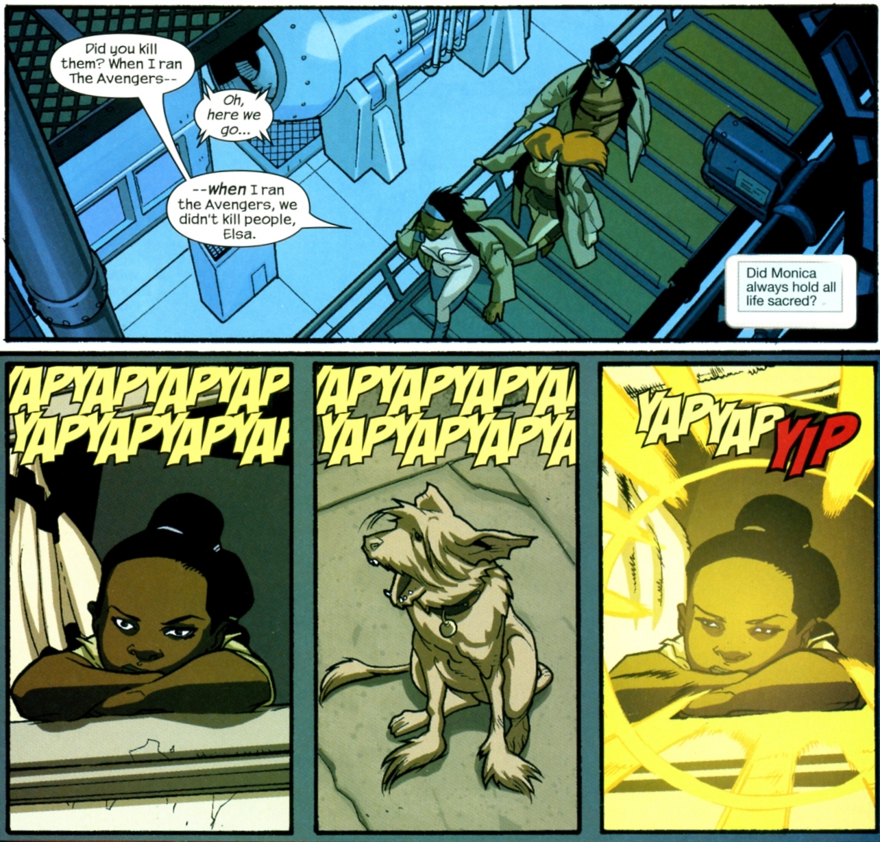
Warren Ellis imagines a childhood with photonic laser powers for Monica Rambeau, also known as Photon, formerly known as Captain Marvel, and one-time leader of the Avengers. Bad doggie be quiet now.
You know we love a good double splash page. Warren Ellis and Stuart Immonen delivered the goods in their sarcastic superhero parody Nextwave: six — count ’em — SIX consecutive two-page spreads. Here, our heroes approach their final confrontation with a secret evil mastermind. But first, they have to slug and blast their way through monkeys in Wolverine suits, dinosaurs with laser eyes like Cyclops, and a bunch of MODOK heads that look like Elvis Presley!
Collector’s Guide: – From Nextwave Agents of H.A.T.E. #11; Marvel, – Reprinted in the Nextwave Agents of H.A.T.E. Ultimate Collection (2010) – Reprinted in the Nextwave TPB #2 – Reprinted in the Nextwave Hardcover
You know we’re Devil Dinosaur fans here. We just go crazy for Jack Kirby’s big red tyrannosaur. But things did not go well for Devil in later years. Let’s look at a scene from Nextwave: Agents of H.A.T.E. Our band of superheroes has been “saving America by beating people up” for twelve issues of hilarity and calamity.
Warren Ellis and Stuart Immomen now bring them face to face with the supreme evil behind the organization who has been giving them so much trouble. At last, they uncover the secret motivations of their foe.
Collector’s Guide: – From Nextwave Agents of H.A.T.E. #12; Marvel, – Reprinted in the Nextwave Agents of H.A.T.E. Ultimate Collection (2010) – Reprinted in the Nextwave TPB #2 – Reprinted in the Nextwave Hardcover
In Planetary #2 we travel to Island Zero. Here we find corpses of famous Japanese movie monsters: Godzilla, Mothra, and Ghidora. As fun as that sounds, things take a turn for the worse when our clinically insane leader forces us at gun-point to snack on the rotting flesh of Godzilla. Barf!
Only Warren Ellis would come up with such a sick idea. His heroes remain bystanders, baffled by the madness. Artists John Cassaday and Laura Martin take us now to the scene of the chow…
Collector’s Guide: – From Planetary #2; Wildstorm, 1999. – Reprinted in Planetary TPB #1 – Reprinted in Planetary Hard Cover #1
Update: As of 2014, the entire series is collected in a single Planetary Omnibus!
Stormwatch’s telekinetic leader Battalion gets a chance to fly solo in this tale by Warren Ellis. Battalion goes on vacation and tries to have a nice day, but some hate militia wannabes go and make it about race! Bad move on their part…
Black Summer is one of my favorite Warren Ellis takes on the idea of superheroes, and maybe the best one since the first twelve issues of The Authority. It doesn’t hurt that he has detail-obsessed artistic powerhouse Juan Jose Ryp rendering every scene to perfection! That guy is something else!
When a super-powered protector of society decides the President of the USA is a criminal, the result is murder, mayhem, revolution, and sci-fi action and insanity. It’s a gore fest, a slug fest, and basically a fest to end all fests! Behold one of the lovely wraparound covers and some bold action pages from inside!
Well, son, if you have a sick mind like Warren Ellis, then superpowers come from tripping your testicles off in the scariest room on Earth! With Juan Jose Ryp drawing the worst nightmare of your life in painfully exacting detail, No Hero asks, “How badly do you do want to be a superhero?”
John Cassaday, working from a Warren Ellis script, re-imagines the spaceship of Galactus in issue 19 of Planetary. Here, the great cosmic being has died and life has evolved in his vessel for millions of years! Even his gigantic corpse has become a biosphere supporting life. AMAZING!
Collector’s Guide: You can get Planetary in single issues or TPBs. As of 2014, the whole series is collected in a single Planetary Omnibus!