In the two years since it was published, Kate Darling’s The New Breed has been well-received and often reviewed. This insightful book from an MIT robotics expert with degrees in law and economics was perfectly timed to inform our global conversations about the subsequent boom in AI-generated art and widespread use of large language models such as ChatGPT. The New Breed also reframes our ongoing discussion of robots in more physical and even humanoid forms, and it does so with a perspective I have not seen before: that our relationships with robots can be better understood in terms of our historical relationships with animals.

You might argue there’s a difference between artificial intelligence and robots—or, like many people, you might find it difficult to precisely define the difference between a robot and a machine. What is the difference between an electric toaster and a Roomba? How does that difference apply when talking about a robotic arm in an auto-parts factory compared to a chatbot? Darling sidesteps such philosophical traps by never insisting on a hard-and-fast definition but instead exploring many stages of how humans have used non-humans to supplement and extend our capabilities—from the ancient domestication of the ox for plowing fields, to the modern development of interactive animal-shaped machines for therapeutic treatments.
How each of these developments shaped society—along with our social, legal, financial, and emotional relationships with them—is Darling’s focus. Her keen sense of history connects the beginnings of how animal-assisted agriculture influenced the developments of cities and the concepts of property rights and marriage, to more recent concerns such as the creation of AI romantic partners seen in films such as Her and our uniquely modern concerns about sex robots. It’s exactly this kind of scope we need to consider if we are to understand how many of the questions about robots are the same questions we have asked and answered when integrating animals into our lives as companions and co-workers.
But what I find most interesting about The New Breed is the idea that our relationships with robots aren’t about the robots themselves but what those relationships say about us as humans. Before I read this book, I would have said it is totally okay to be mean to a robot—to curse it, beat it, mangle it, or brutally destroy it—because the robot has zero feelings or thoughts and is merely a complex machine.
After reading this book, especially the parts about robots who provide lifelike feedback and provide life-saving services to their human operators, I’m not so sure. Could it be that the most important aspect of human nature that leads to social cohesion is our capacity for empathy and compassion? Could it be that creating objects we can be cruel to might be reinforcing our unsavory tendencies toward cruelty?
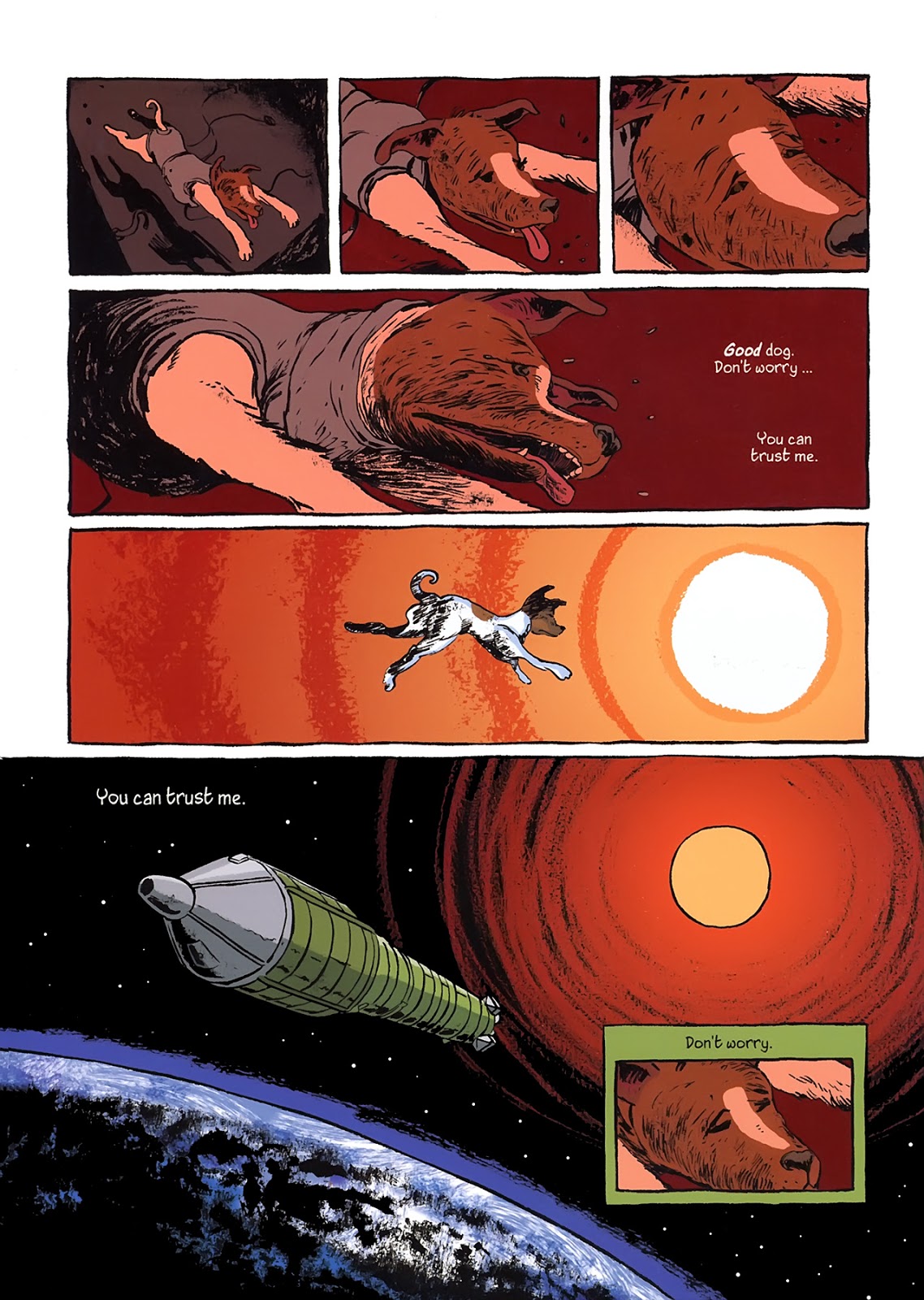
Darling asks, for example, that even if it is ethically acceptable for a child to kick a robot dog, shouldn’t we be considering how that might influence the child’s behavior toward real dogs? How much scarier is that question when we make the robot resemble a human?
Some might find it silly that people in studies struggled with beating to “death” a cute robot dinosaur that gave pre-programmed but lifelike indicators that it was suffering, or that soldiers with bomb-detecting robots would be moved to tears and offer up 21-gun salutes when their life-saving robots “died” in action. But doesn’t that say something important about the empathy and ability to emotionally connect that makes being part of the human race bearable?
Along the way, Darling explores the concern that robots might replace humans and take their jobs. She deftly navigates this minefield by exploring how we should be thinking of robots supplementing our labors by taking over tasks that are “Dull, Dirty, or Dangerous”, and how the inevitable shift in the division of labor will push humans toward doing work that requires a flexible, creative, human mind to oversee and correct the robots.
In light of how every technological advancement from domesticating horses to creating robot arms in factories has followed the same trajectory of shifting the human component of labor into new areas, we can expect some longstanding human jobs to be lost. On the other hand, from the early humans who became managers of the oxen who began plowing fields to the cashiers who became managers of the product-scanning robots in the self-checkout lanes of major grocery stores, this shift in what human workers need to do is as old as history itself.
One of Darling’s most compelling concerns is about what these developments mean for us in a global, capitalist society. As she states in the book and in many interviews, her concern is not that sex robots will actually replace human intimacy, but whether the sex robots will have compelling “in-app purchases” like many modern videogames. How will corporations exploit human vulnerability? How will they exploit the inevitable emotional bonds we form with robots?
So many people are concerned about the oft-repeated science-fiction trope of a violent robot uprising against humans that they forget the real problem is not with robots but with the social and financial context in which they are being created. Unless we as humans can create more equitable, just, and human-centric systems of everything from politics to labor, then the real problem is not the technological advancements in artificial intelligence and robotics. The real problem is us.
The New Breed is available on Amazon in many formats. The UK edition has a different subtitle and cover.


:focal(638x484:639x485)/https://public-media.si-cdn.com/filer/87/df/87df4f91-10eb-417e-82d4-d585554a2f2c/02_babysquid_008.jpg)